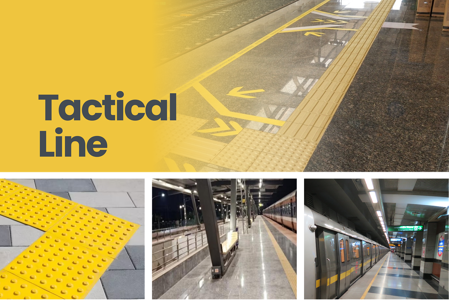
Have you ever noticed those bright yellow tiles in a metro station or any other station platforms? If you’ve ridden a train in a country like India, chances are you’ve seen them. But did you know they’re not just a random design choice? These yellow lines serve a critical and tactical purpose, underscoring the importance of accessibility in design.

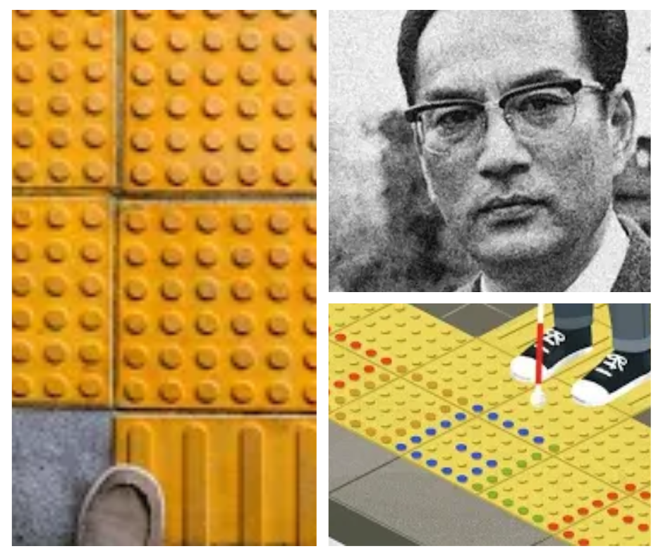
The history of these tiles is rooted in inclusivity, beginning with Seiichi Miyake's invention in Japan in 1967. Miyake was motivated by a desire to help visually impaired individuals navigate public spaces safely. His thoughtful approach led to the creation of tactile paving, which uses raised patterns and dots to provide guidance.
What are these tiles?
Yellow tactile tiles, also known as tactile paving or detectable warning tiles, are part of a broader system designed to assist visually impaired individuals navigate metro stations safely. These tiles feature three-dimensional raised patterns and dots that can be felt underfoot or with a cane, providing essential guidance in environments where vision alone isn’t enough.
Seiichi Miyake's Vision:
Invented by Seiichi Miyake in Japan in 1967, the system was created to help people with visual impairments move through public spaces with confidence and independence. Miyake’s design emerged from his commitment to improving accessibility and ensuring that everyone could navigate urban environments safely. His innovative approach involved experimenting with different patterns and materials before finalising the tactile paving system we see today.
What would have been the problem to resolve?
Seiichi Miyake’s inspiration for tactile paving wasn’t born from a formal design process, but from a deeply personal experience and keen observation. Here's the story of how he came up with the idea:
Miyake, a Japanese inventor, was motivated by the plight of a friend who was losing their vision. Witnessing the challenges his friend faced navigating public spaces, Miyake took it upon himself to find a solution. In 1965, and using his financial resources, he began developing special mats featuring raised shapes. These weren't intended as a large-scale project initially; they were a bespoke solution crafted to help his friend avoid danger and move safely.
It's a beautiful story of observation, empathy, and a simple yet profound insight transforming how we create inclusive public spaces. The idea wasn’t born in a lab or from extensive research, but from a moment of empathy and connecting a common, everyday observation with a real-world need.
Assumption: Visually impaired individuals struggle to navigate in public places safely due to a lack of tactile and visible guidance.
Solution
Raised Patterns: The tiles have distinct raised dots and lines that provide tactile feedback. This allows individuals who are visually impaired to “feel” their way through the station using their feet or canes.
Safety Guidance: Raised dots near platform edges, escalators, or stairs signal caution zones. These tactile cues alert users to potential hazards, helping them avoid accidents.
Straight Paths: Long, straight lines guide visually impaired passengers in a clear direction. This ensures they can move confidently from the platform to the train or exit without getting lost.
High Visibility: The bright yellow colour is highly visible, making it easier for people with low vision to follow the path. This dual approach, combining tactile and visual cues, ensures the system is accessible to a wide range of users.
Standardisation: Tactile paving systems are standardised across metro stations globally. Consistency in design ensures that visually impaired individuals can rely on these tiles no matter where they travel.
The yellow tactile tile system is a powerful example of how thoughtful design can create inclusive environments. For UX designers, this highlights the importance of considering accessibility from the very beginning of any project.
Imagine a world where public spaces weren’t designed with these principles in mind. Metro stations would be disorienting for visually impaired individuals, and navigating them safely would feel like a constant challenge. The yellow tiles remind us that design isn’t just about aesthetics; it’s about functionality and equity.
In UX design, accessibility is often an afterthought. But as the global adoption of tactile paving shows, inclusive design can be both intuitive and impactful. By integrating features like tactile feedback, high-contrast colours, and clear pathways into our designs, we can create products and spaces that empower everyone, regardless of ability.
Their widespread adoption speaks to the success of Miyake’s invention. What started as a localised solution has become a global standard, proving that accessibility can be both practical and scalable.
This global approach also highlights the importance of collaboration in design. By learning from existing solutions like tactile paving, we can create systems that are not only effective but also easy to implement across different cultures and contexts.
Appriciation
Seiichi Miyake's legacy lives on through the tactile paving system he invented, demonstrating how one person's vision can lead to global change. As UX professionals, we have the opportunity—and responsibility—to create solutions that empower everyone. By prioritising accessibility in our work, we can build products and environments that are truly equitable. The next time you see those bright yellow tiles, take a moment to appreciate the thoughtful design that makes them possible. And let it inspire you to think about how your work can contribute to a more inclusive world.
References:
https://timesofindia.indiatimes.com/etimes/trending/what-do-the-yellow-striped-tiles-on-metro-and-railway-stations-mean/articleshow/119033185.cms
https://www.mapsofindia.com/my-india/india/why-does-the-yellow-tiled-path-exist-on-metro-stations
https://curlytales.com/why-do-metro-stations-in-india-have-yellow-tiles-heres-what-they-really-mean/
https://www.dnaindia.com/web-stories/education/why-do-metro-stations-have-yellow-lines-1743761504613
https://keralakaumudi.com/en/news/lifestyle/general/some-tiles-on-railway-platforms-are-yellow-not-for-design-purposes-know-the-history-objective-and-types-of-yellow-tiles-1536369
https://www.smithsonianmag.com/innovation/the-story-of-the-tactile-tiles-that-guide-blind-people-and-how-they-came-to-be-180973103/
https://www.mentalfloss.com/article/577187/seiichi-miyake-and-tactile-paving-google-doodle


